
kartra / 2025-2026
Redesigning the Kartra ecosystem to accelerate user acquisition.
As Lead Visual Designer, I drove Kartra’s end-to-end brand refresh and responsive website redesign. Collaborating with a cross-functional growth team, I designed optimized DTC conversion funnels and premium product visuals to accelerate user acquisition.
Contribution:
Brand Refresh
Responsive Site Redesign
Sales Funnel Optimization
Promo Campaigns/Paid Ads
Tools:
Figma
Adobe AfterEffects

The Challenge
Overcoming an outdated visual identity and fragmented web ecosystem to unlock user growth
Kartra’s unresponsive website and outdated visual identity created heavy friction in the acquisition funnel, preventing prospects from understanding the platform’s value. As Lead Visual Designer, I collaborated with a cross-functional growth team to execute a brand refresh and responsive website redesign aimed at optimizing conversion and accelerating user growth.
The solution
A premium brand identity & conversion-driven responsive web experience.
01
Execute end-to-end brand refresh
Reimagined the core digital experience from the ground up, deploying a premium visual system across the high-traffic homepage, pricing page, and feature pages to elevate brand perception and engagement.
02
Optimize the sales funnels
Redesigned high-impact conversion pathways and streamlined the acquisition experience with a clear information architecture built to drive free trials and immediate pay subscriptions.
03
Deploy a responsive framework
Built a flexible, responsive layout system that eliminated engineering handoff friction, ensuring seamless brand consistency across Figma and CMS templates.
Brand refresh

Brand Color Standards & UI Tokens
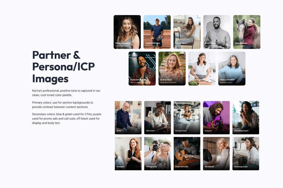
Curated Brand Photography & Partner Imagery
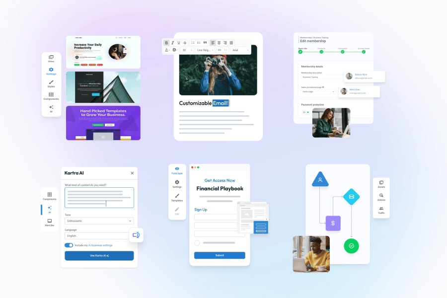
Modular Product UI & Feature Graphics

Product Feature Cards & Marketing Modules

Core Homepage Architecture & Visual Redesign

Cross-Device Responsive Page Architecture
High-impact conversion pathways
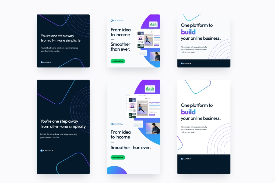
Performance Marketing & Ad Creative Assets
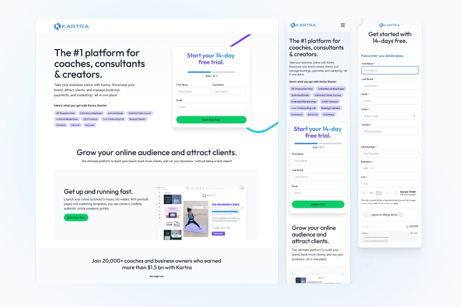
High-Converting Funnel & Custom Checkout Experience
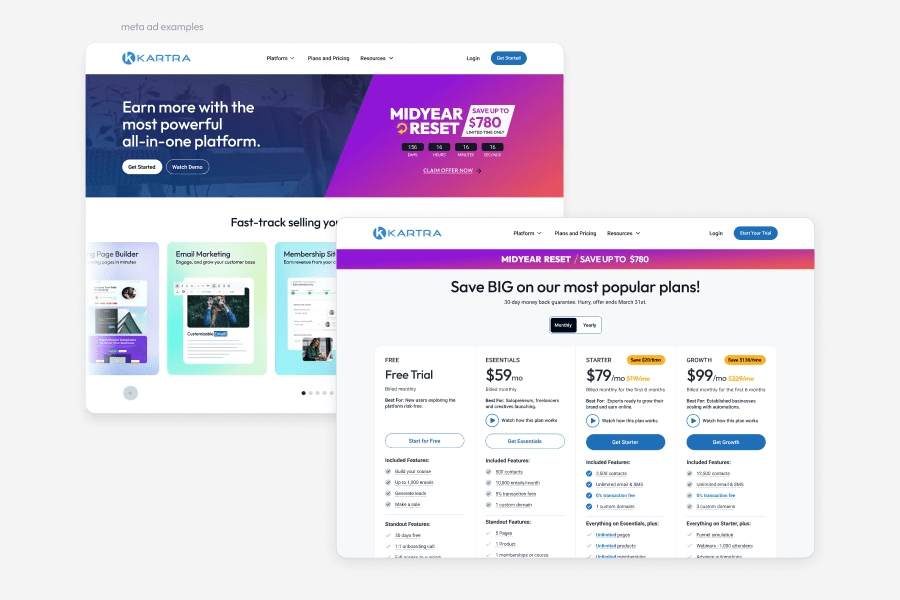
Promotional Campaign Assets & Pricing Page UX
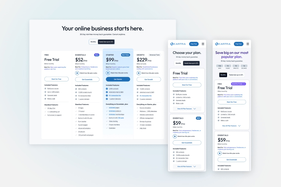
Mobile-Optimized Evergreen & Promo Pricing Tables
Responsive framework
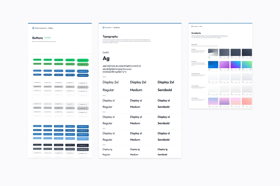
Scalable Design System Built from Scratch
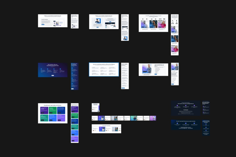
Figma Component Library Mapped to Custom CMS
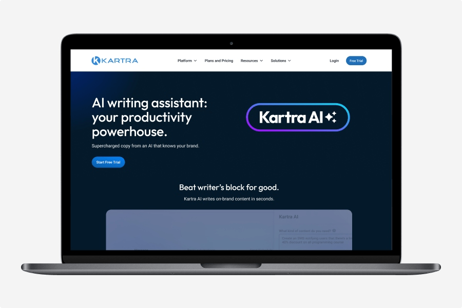
High-Fidelity Feature Launch Experience
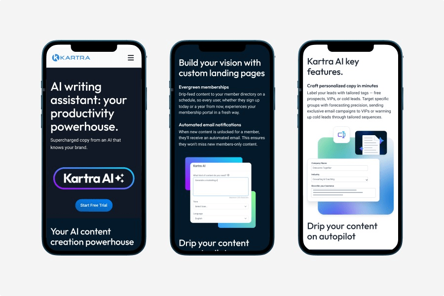
Responsive High-Fidelity Mobile Experience
Discovery & Strategy
Framing the problem, business goals, & user needs
PROBLEM STATEMENT & GOALS
The legacy website suffered from high information density and structural fragmentation, which directly stalled user conversion funnels.
- Inconsistent Visual Systems: Fragmented page layouts and mixed component styles diluted brand trust across the marketing site.
- Vague Value Positioning: Product positioning lacked immediate clarity, making it difficult for new visitors to understand the platform’s core capabilities.
- High Cognitive Load: Excessive text density and poor typographic hierarchy overwhelmed prospects during feature evaluation.
- Rigid Navigation Hierarchy: A chaotic navigation structure made product exploration difficult and hidden.
- Friction-Heavy Pathways: Conversion funnels felt disconnected, creating friction between the educational content and the primary call-to-action blocks.
The core challenge
Prospective customers struggled to quickly understand the platform’s ecosystem, its primary target audience, and its competitive edge. This friction during the evaluation phase directly damaged trial conversion confidence.

Business Goals
- Improve clarity of Kartra’s value proposition
- Strengthen trust and credibility
- Simplify the buyer journey
UX Goals
- Reduce cognitive overload
- Improve scannability
- Improve mobile usability
Stakeholder Goals
- Increase conversions to free trial
- Better communicate Kartra’s all-in-one positioning
- Clarify product capabilities
Research Questions
- What confuses first-time visitors?
- Which messaging creates the most friction?
- Do users understand the “all-in-one” value proposition?

COMPETITIVE ANALYSIS
Benchmarking market leaders: a comparative system audit
Strategic Objective
I conducted a visual and structural audit of four industry-leading platforms, evaluating them across three distinct lenses: Visual Design (systems and aesthetics), Storytelling (messaging layout and flow), and Outcomes (conversion pathways and user actions). This framework identified critical market gaps and layout opportunities for our redesign.
I conducted a visual and structural audit of four industry-leading platforms, evaluating them across three distinct lenses: Visual Design (systems and aesthetics), Storytelling (messaging layout and flow), and Outcomes (conversion pathways and user actions). This framework identified critical market gaps and layout opportunities for our redesign.
Leaders of the pack: benchmarking the competition
I analyzed four industry-leading marketing platforms, identifying strengths, weaknesses, and opportunities for design inspiration and brand differentiation.

Active Campaign

Click Funnels

Kajabi

Thinkific
Strengths
- Visual Identity & Messaging: Uniform design tokens and polished tech styling build immediate brand authority.
- User Experience: Highly intuitive navigation paths lock primary CTAs directly into user focal zones.
- Content Strategy: Progressive disclosure breaks complex product technical details into digestible scroll blocks.
Weaknesses
- Visual Identity & Messaging: Over-reliance on generic stock photography makes competing platforms look completely interchangeable.
- Storytelling: Repetitive “Z-pattern” layout grids trigger visual fatigue and prompt users to skim.
- Content Strategy: Product descriptions rely heavily on dense jargon, creating excessive onboarding cognitive load.
Opportunities
- Visual Identity & Messaging: Stand out using a tactile aesthetic that mixes real UI mockups with vibrant accent layers.
- User Experience : Replace repetitive rows with a dynamic, card-based component system to drive engagement.
- Content Strategy: Frame the product narrative around contextual user scenarios and loop animations instead of flat icons.
Threats
- Visual Identity & Messaging: Aesthetic trends move quickly; our foundational style choices must remain premium and enduring.
- User Experience: Competitors continuously run optimization loops, meaning our system must scale rapidly to keep pace.
- Content Strategy: Established market mental models require us to innovate content flows without breaking layout usability.
USER PERSONA
Bringing the user to life
To make my research findings more tangible, I created a user persona which provided a holistic view of the target user that will shape my design decisions
Understanding our user: meet Myla!
Building out this persona kept our target audience front and center. Knowing exactly who we were designing for made it much easier to tailor our visual style, imagery, and messaging to match the real business challenges our users face every day.

Site Architecture & UX Strategy
Aligning business goals, user needs, and content structure
PAGE ARCHITECTURE
Structuring information for complex SaaS ecosystems
To translate Kartra’s feature-heavy ecosystem into an intuitive user journey, I focused on reducing cognitive overload. By restructuring the information architecture and mapping clean, mid-fidelity layouts, I created a scalable blueprint for rapid product discovery.
- Categorized Navigation: Grouped complex feature sets into clear, logical navigation categories to instantly show visitors what Kartra does.
- Video Demo Wireframe Pattern: Engineered a standardized page structure featuring a prominent video container on every product subpage to visually demonstrate tool utility.
- Clean & Responsive Pricing: Wireframed a modern, flexible pricing grid to make feature-tier comparisons effortless across both desktop and mobile viewports.

DESIGN SYSTEM & UI KIT
Building a scalable UI ecosystem from the ground up
When I joined this project, the organization completely lacked a unified design library, leading to high visual debt and fragmented development handoffs. I engineered a programmatic UI kit from scratch and modernized our team workflows to bridge the gap between design and production.
- Workflow Transformation: Transitioned the internal marketing team to a centralized Figma workspace, introducing a modern, standardized asset workflow.
- Component Foundations: Built an extensive foundation from scratch—evolving the legacy branding into a vibrant, modern color scale alongside global type tokens and strict button variant states.
- Cross-Functional Leadership: Managed 2 front-end developers to audit WordPress page builder ecosystems, ensuring our Figma assets translated perfectly into a reusable pattern library.
- Seamless Handoff Governance: Maintained strict component parity across design and engineering, drastically lowering development cycles and eliminating layout inconsistencies.
Every design choice—from the vibrant colors to the bold typography was chosen to make Kartra feel like a premium, trustworthy platform. This new visual style keeps the look and feel completely consistent across every single page and template.
VISUAL IDENTITY & BRAND STYLING
Translating brand strategy into premium UI assets
With the core structural wireframes and atomic design tokens established, I crafted a unified brand guide and visual style. The goal was to modernize the platform’s presence, elevate digital authority, and create a visually engaging narrative layout across all digital touchpoints.
- Evolved Brand Aesthetics: Refined the core visual identity by balancing a vibrant primary blue with deep neutrals and bright gradient accents to anchor user attention.
- Typographic Hierarchy: Selected and configured a premium, highly scalable display typeface (Outfit) to ensure bold, clear, and modern headlines.
- Component-Driven Visuals: Designed clear navigation components, functional iconography sets, and structured layout patterns to guarantee crisp presentation across every viewport.
Figma design system example

Brand guide overview
