
webinarjam / 2025-2026
Driving organic user acquisition for a leading automated webinar platform.
As Lead Visual Designer, I owned WebinarJam’s brand refresh and migration, deploying SEO visual storytelling and AI workflows to optimize high-converting webinar layouts and scale content traffic.
Contribution:
Brand Refresh
Responsive Site Redesign
Platform Migration
AI Design Workflows
SEO Visual Storytelling
Tools:
Figma
Adobe AfterEffects

The Challenge
Driving a strategic brand refresh to overcome legacy platform constraints and accelerate content discovery
WebinarJam’s existing web infrastructure lacked the flexibility to support modern, high-bandwidth video storytelling or dynamic content strategy. A rigid platform architecture and fragmented user paths prevented prospects from quickly realizing the software’s core product value.
The solution
An AI-optimized visual ecosystem & frictionless web experience
01
Modernize the brand system
Created and evolved the brand strategy, visual identity, UI/UX, and content from the ground up, building a cohesive design language across high-converting home, pricing, and feature pages, social, paid media, and corporate collateral.
02
Deploy an AI content workflow
Redesigned key marketing pages and used AI tools to quickly generate variations for our video layout testing, making sure we maximized trial sign-ups.
03
Execute a seamless migration
Designed a flexible system that eliminated engineering handoff bottlenecks, aligning brand consistency across both marketing layouts and digital product components.
Brand refresh

Persona-Targeted AI Imagery Direction
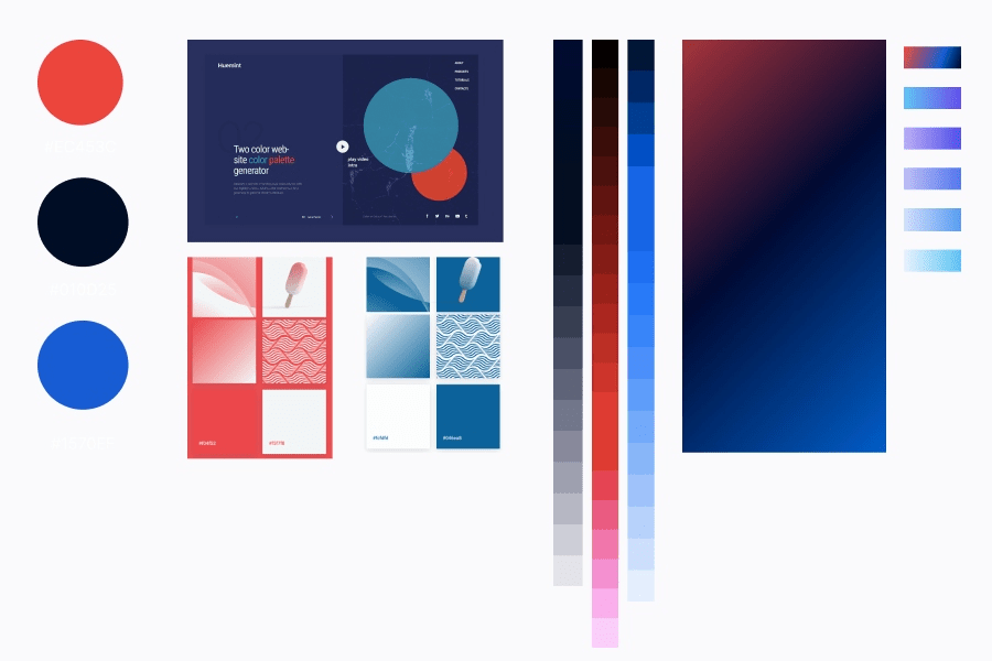
Modernized Color Architecture & System
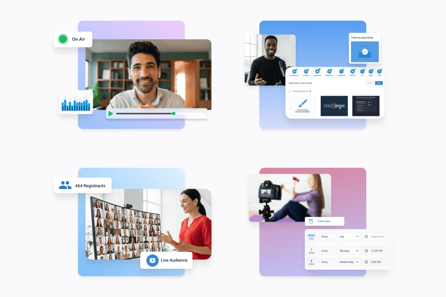
Platform Interface & UI Showcase
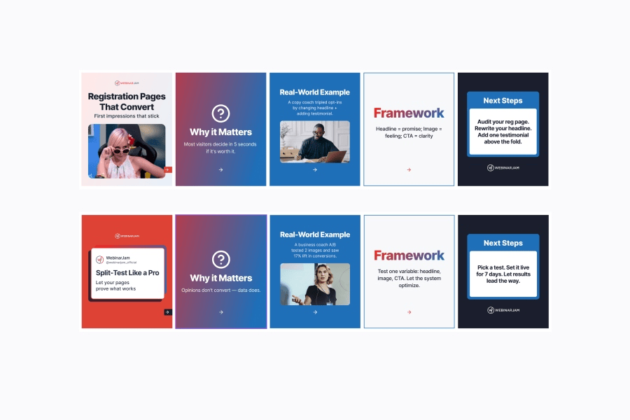
Omnichannel Social Media Surfaces
AI content workflow

AI Prompt-to-Layout Content Pipeline

AI Content Structuring & Site Taxonomy
Scalable web system

Desktop Modular Page Architecture
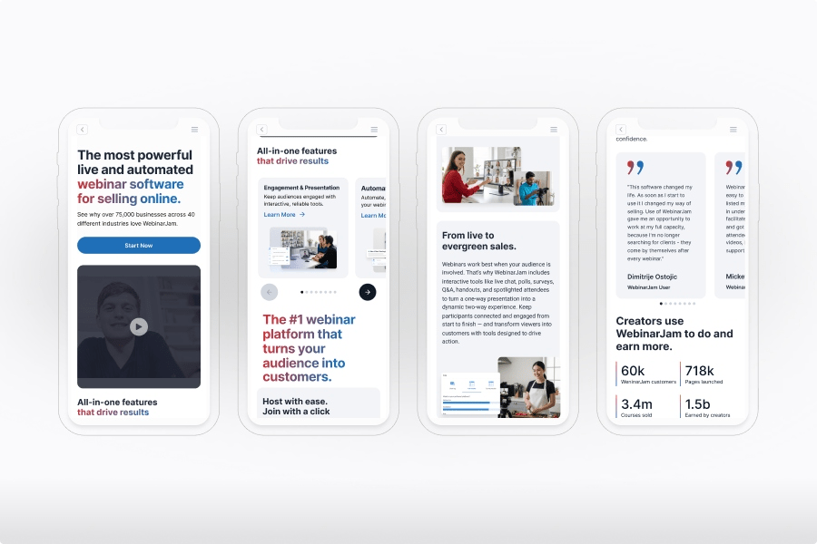
Responsive Mobile Web System

High-Converting Core Home Page

Modular Product & Funnel Experience
Discovery & Strategy
Framing the problem, business goals, & user needs
PROBLEM STATEMENT & GOALS
The legacy single-page website failed to anchor its identity as a video platform, relying on unstructured layout patterns that severely damaged conversion confidence.
- Absence of Video Assets: Despite being a premier live webinar platform, the website failed to feature any video demos or interactive product previews.
- Undefined Audience Targeting: The marketing layout completely lacked a defined target audience or clear, high-level value proposition.
- Zero Brand Infrastructure: The team operated without a centralized design system or brand guidelines, resulting in absolute visual layout fragmentation.
- Broken Responsive Funnels: Poorly scaled component hierarchies resulted in a frustrating mobile experience, creating a critical bottleneck for mobile user traffic.Friction-Heavy Pathways: Conversion funnels felt disconnected, creating friction between the educational content and the primary call-to-action blocks.
- Absence of SEO Strategy: A complete lack of clear page hierarchy and search engine optimization prevented organic discoverability.
- Unoptimized for AEO Models: The flat, text-heavy layout was entirely unoptimized for modern Answer Engine Optimization trends.
The core challenge
Prospective clients landed on a text-heavy interface that obscured the platform’s actual software capabilities and target market use cases. Because the layout lacked structural foundations and visual demonstration tools, it failed to build buyer trust—especially on mobile viewports—requiring an absolute ground-up structural redesign.

Business Goals
- Improve market competitive brand awareness
- Communicate a defined target value proposition
- Build immediate platform authenticity and trust
UX Goals
- Design a mobile-first responsive strategy
- Lower cognitive load via clean layouts
- Transition the layout to a solution-based model
Stakeholder Goals
- Boost trial numbers and conversions
- Validate software value using video demos
- Restructure site architecture for outcome discovery
Research Questions
- Why is mobile drop-off so high?
- Does the visual identity feel trustworthy?
- How can features become intuitive solutions?

MARKET LANDSCAPE
Finding the gap: Where the competition falls short
The Approach
I used an LLM to analyze competitor data, user reviews, and feature lists against WebinarJam. This mapped out exact market weaknesses, giving us the clear insights needed to build a better alternative.
I used an LLM to analyze competitor data, user reviews, and feature lists against WebinarJam. This mapped out exact market weaknesses, giving us the clear insights needed to build a better alternative.
Benchmarking the leaders
I analyzed four top marketing platforms to spot their strengths and weaknesses, finding design inspiration and ways to make our brand stand out.

GoToWebinar

Webex

Demio

BigMarker
Strengths
- Established Infrastructure: Platforms like Webex and GoToWebinar deliver incredibly stable, enterprise-scale event hosting capability.
- Clean Live Interfaces: Alternatives like Demio successfully offer modern, minimal presentation spaces with solid real-time attendee engagement.
- Deep Developer Control: Leaders like BigMarker provide extensive customizability for enterprises needing total integration authority.
Weaknesses
- Outdated Legacy Styling: The oldest names in the space suffer from rigid, ancient aesthetics that feel cold and corporate.
- Severe Feature Isolation: Most competitors lack built-in marketing automation or sales tools, creating highly fragmented user flows.
- Inflated Technical Complexity: Platforms that offer deep customization do so by overwhelming the user with dense configuration fields and steep learning curves.
Opportunities
- Eliminate Costly Complexity: WebinarJam can win by providing an all-in-one funnel, erasing the need for expensive third-party tools.
- Conversion-Focused Tools: We can capture small businesses by explicitly designing integrated sales, lead generation, and marketing features.
- Value-Driven Simplicity: We can stand out by wrapping powerful, enterprise-grade webinar tools in an intuitive, highly accessible layout.
Threats
- Forced Software Ecosystems: Competitors lock users into massive corporate product bundles, making standalone platform migration difficult.
- Entrenched Workflows: Users are deeply accustomed to standard, administrative tools, requiring our conversion narrative to feel incredibly seamless.
- Continuous Platform Updates: Industry giants constantly run optimization updates, meaning our new visual layout must scale programmatically to adapt.
USER PERSONA
Bringing the user to life
To transform my competitive research into functional design solutions, I established a clear profile of WebinarJam’s primary target audience. By mapping out their specific business goals and software frustrations, I ensured that every layout choice, video demo placement, and navigational category directly solves a core user pain point.
Understanding our user: meet Josh!
By analyzing the real-world profiles, motivations, and operational roadblocks of solopreneurs like Josh Hill, I gained a clear view of our primary user’s exact needs. Mapping out his target goals—such as lead generation and revenue automation—alongside his daily frustrations with disconnected marketing tools directly guided how I structured the final website interface.

Page Architecture
Structuring a feature-heavy ecosystem for strategic discovery
PAGE ARCHITECTURE
Simplifying information architecture for feature-heavy video platforms
To translate WebinarJam’s complex feature set into an intuitive user journey, I focused on reducing cognitive overload. By utilizing an AI-accelerated synthesis process to map legacy layouts into clear global navigational pillars, I created a highly structured blueprint for rapid product discovery.
- AI-Powered Navigation Categories: Audited the legacy site by feeding original page screenshots into a Large Language Model (LLM) to organize its massive catalog into clear, solution-based product pillars.
- Contextual Feature Storytelling: Mapped out strategic layout modules dedicated to highlighting user outcomes, ensuring complex technical tool benefits are communicated through relatable business scenarios.
- Intuitive Feature Prioritization Grid: Restructured the dense comparative table matrix to surface primary feature differences instantly, speeding up selection time while making the information scale flawlessly across compact mobile screens.

VISUAL IDENTITY & BRAND STYLING
Translating brand strategy into premium UI assets
With the core structural wireframes and atomic design tokens established, I crafted a unified brand guide and visual style. The goal was to modernize the platform’s presence, elevate digital authority, and create a visually engaging narrative layout across all digital touchpoints.
- Building a Video-First Aesthetic: I updated our visual identity by balancing a trust-building primary blue with deep neutrals and bright gradient pops. This kept the layout feeling energetic while naturally guiding the user’s eye to our video and product previews.
- Setting a Modern Typographic Tone: I selected and structured a premium, highly scalable display typeface (Inter). This gave our headlines a bold, modern look that immediately feels more like a top-tier tech platform and less like a corporate legacy tool.
- Designing for Visual Consistency: I built clean navigational components, custom iconography, and responsive layout patterns. This gave us a centralized design system that ensures our brand looks sharp and cohesive across every single device.
Brand guide overview

Figma design system example
